Coverings 2026 Recap: Tile Trends Defining The Year
Every spring, the tile industry comes together for Coverings—an event our team looks forward to attending each year.
Conor Firkins had the chance to connect with many of the manufacturers we partner with and carry in our showroom. After spending time at the show, he shared his biggest takeaways with our team, with a few themes coming through right away.
With miles of exhibits to walk through, the scale of the show is always impressive. A few standout booths even took home “Best in Show” and “Best Display” awards, which speaks to how much thought manufacturers are putting into not just their products, but how they present them.
Across nearly every vendor, there was a clear, shared direction: warmer palettes, more dimensional surfaces, and a thoughtful use of pattern and scale showed up again and again. Rather than one standout trend, it was the way these elements worked together that defined the exhibition space.
It’s a shift that feels practical and one that’s already starting to show up in the kinds of spaces our customers are asking for.
Our Takeaways At A Glance:
Warmer, more natural color palettes replacing cooler tones
Increased focus on texture and surface variation
A softer, more refined approach to natural stone looks
Pattern and scale used more intentionally
Continue reading for a more detailed recap of the most noticeable trends from this year’s show.
Ivory Vein-Cut Pagosa by Florida Tile
A Warmer Direction For Tile Design
One of the most noticeable changes this year was the continued move away from cooler tones and high-contrast marble looks.
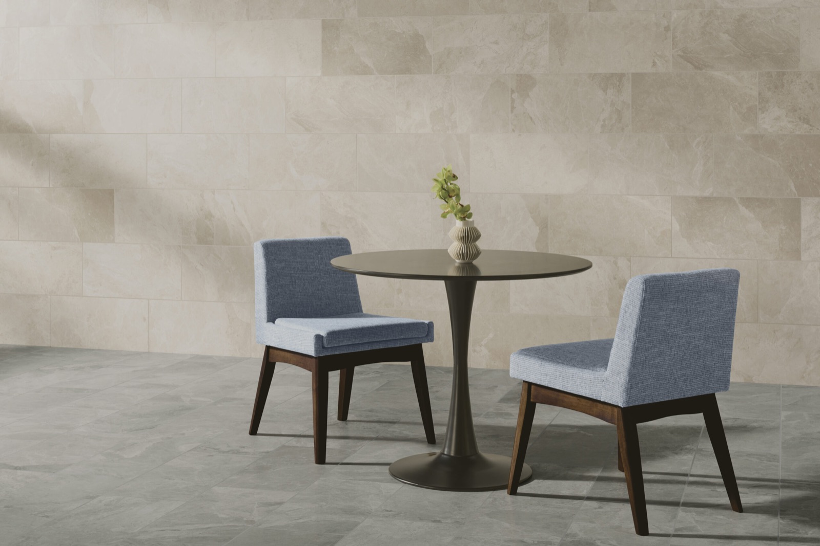
In their place, we saw more warm neutrals like creamy whites, soft taupes, and sandy tones. Even marble-inspired designs felt softer, with more subtle movement and less stark contrast.
This shift was especially clear in what we saw from Florida Tile. Several of their newest collections lean into sandstone-inspired visuals and oak-look finishes, with color palettes that range from warm vanilla and caramel tones to richer, wood-inspired hues. The result is tile that feels grounded and natural, with just enough variation to add interest without overwhelming a space.
These palettes bring a different kind of flexibility to a space. They pair easily with:
Natural wood cabinetry
Matte black or brushed brass fixtures
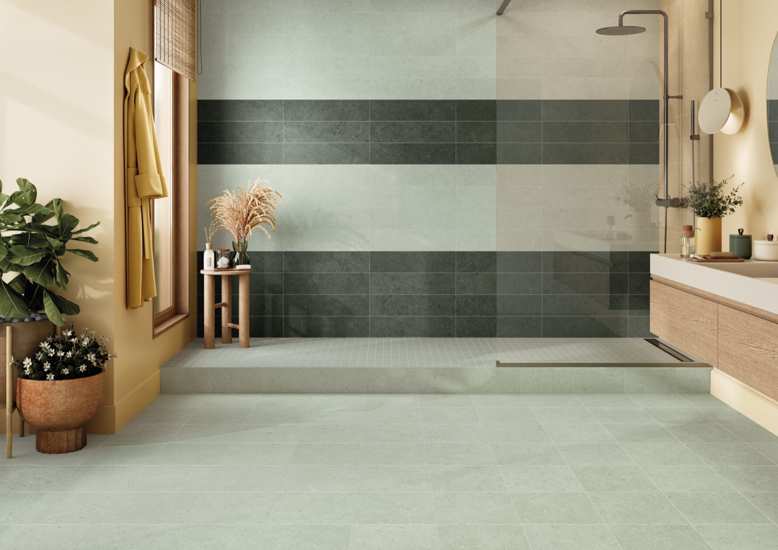
Warmer paint tones like soft whites or muted greens
The result is a space that feels more connected, comfortable, and easy to live in.
Cleve by Crossville Tile
Texture, Everywhere You Look
Texture was one of the most consistent elements across the show floor.
Manufacturers are continuing to refine how texture is built into tile, often using ink injection technology to create more depth and variation. While the technology itself isn’t new, the level of detail being achieved continues to improve.
We saw a wide range of approaches, including:
Subtle surface variation that adds quiet movement
More tactile finishes that create stronger dimension
Layered textures that catch light and shift throughout the day
We also saw more experimentation with surface finishes, including subtle matte and glossy contrasts that add another layer of depth while still keeping the overall look understated.
This came through clearly in new collections from Crossville Tile, especially with their Cleve line. Inspired by the natural split of quartzite, the surface has a layered look with soft variation and a slight crystalline effect that catches the light.
In many cases, texture is doing more of the design work. It adds interest without relying on bold color or pattern, making it easier to incorporate across a range of spaces.
Majesto by Anatolia
A New Take On Natural Stone
This year, we saw a clear presence of Taj Mahal-inspired surfaces—soft, creamy marble looks with subtle veining—along with both vein-cut and cross-cut travertine. Each cut brings out a different side of the material:
Vein-cut highlights more linear, directional movement
Cross-cut creates a softer, more organic pattern
These materials are familiar, but the way they’re being interpreted in tile feels more refined, with greater variation in tone and movement.
That direction was especially evident in what we saw from Anatolia. Their upcoming Majesto collection brings together a range of stone influences, from marble and limestone to quartzite and travertine, all translated into porcelain.
What stands out is the range:
Large-format panels for more seamless applications
Standard field tile for flexibility
Smaller mosaics to introduce detail and variation
Beyond Taj Mahal Alabaster by Atlas Concorde
We saw a similar level of refinement from Atlas Concorde. Their latest marble-look porcelain, inspired by Taj Mahal stone, features:
A softer, more tonal palette
A smooth, velvety finish
A range of formats that support multiple applications
Rather than focusing on exact replication, these collections are capturing the overall feel of natural stone in a way that works across a wider range of spaces.
Ezmano by Tiles of Ezra
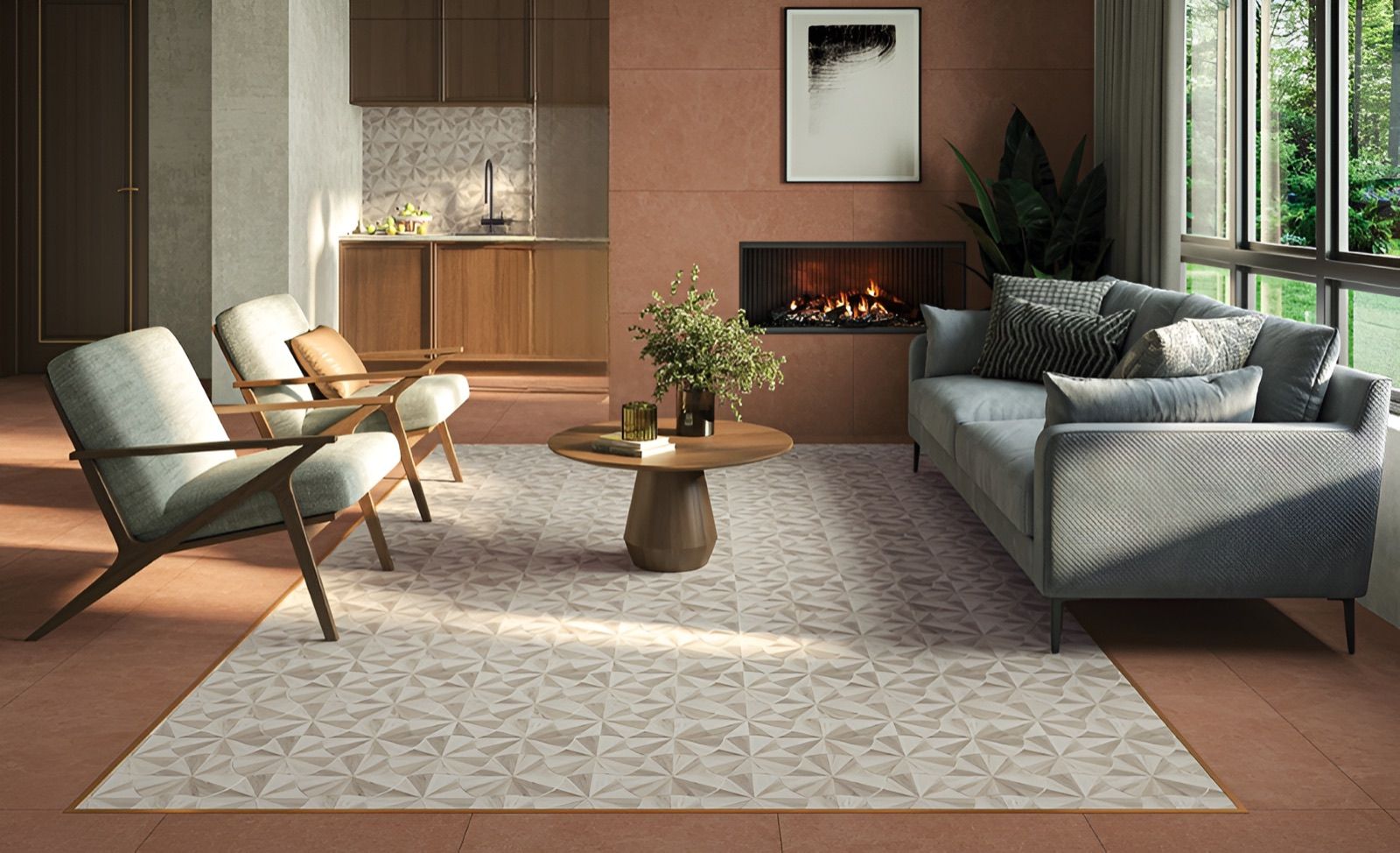
Designing With Pattern And Scale
Pattern continues to play an important role in tile design, but its use has more intention.
Instead of covering an entire space, patterned tile is often applied more selectively, such as:
Backsplashes
Accent walls
Smaller design moments within a larger space
Smaller-format tile is also being used in more creative ways, often arranged in larger, wallpaper-style patterns that create impact without adding complexity to the installation.
At the same time, large-format tile and panels were widely represented across manufacturers. These formats help:
Minimize grout lines
Create a more continuous surface
Ready to See These Materials in Person?
Book a free consultation and let us help you choose the right tile for your project.
Book Appointment